|
|
|
|
|
|
Color
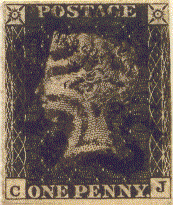
It might seem strange that color would be an issue in regards to the Penny Blacks considering that they are in fact black! However, there are to considerations in the area of color. The first is the effect of plate wear on the observer. The Stanley Gibbons catalog provides the categories "intense black," "black," and "gray black." As the details of the portrait and the machine turned background design gave way to wear, the amount of "white" space exposed in the design produces the appearance of a lighter and in the case of heavy wear, gray appearance. It makes sense that the catalog value is higher normally for the intense black or gray black stamps as the intense stamps are early printings which show great clarity and the beauty of the engraved design. It is also an aid to plate identification because plate dots and guide lines and other minute details are most likely still intact on the early printings. The gray stamps are worn, and reveal clues as to which plates they originate from, with or without repair.
|
|
|
|
|
|
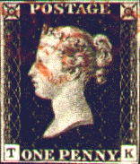
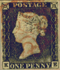
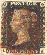
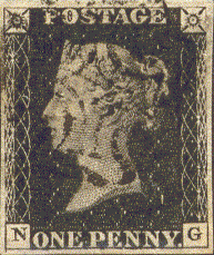
In the above examples we see an example of Plate 5 in intense black, Plate 6 in black, a later printing of Plate 5 in gray-black and an example of Plate 11 in the characteristic grey-black of the later period. I found through my own observations that Plate 4, 5, and 6 are frequently found in intense to black shades, Plate 1a and 1b in black to gray-black shades (due to wear) and Plates 7, 8, 9, 10, and 11 in black to gray-black. It is interesting that many of the later plates appear in a sort of gray- black even though it is not the result of plate wear. it would appear to be a change in the ink used for the later printings of the Penny Black. The Color of the stamp, often in conjunction with the color of the Maltese Cross can be initial clues towards determining the plate of origin.